top of page

Juventus
Sport Branding
In this project for Colosseum, I developed a collection of style frames that establish the visual identity and branding of Juventus.
Media: Adobe Illustrator, Adobe Photoshop, Adobe After Effects

Research
Colosseum is a premium sports package design company that creates dynamic visual identities and branding for teams and organizations.
Combining creativity, strategy, and innovation, Colosseum delivers style frames, design systems, and motion packages that capture team spirit, energize audiences, and set a powerful standard for sports storytelling and presentation.


The team I will be creating a identity for is the famous Juventus. Juventus, founded in 1897 in Turin, is one of Italy’s most successful and historic football clubs. Known as “La Vecchia Signora” (The Old Lady), it embodies excellence, discipline, and innovation.
With numerous Serie A titles and a global fanbase, Juventus represents the pinnacle of Italian football tradition and modern ambition.


The current Juventus F.C. logo distils the club’s identity into a sleek double-“J” mark: bold, minimalist and instantly recognizable. The accompanying custom sans-serif typeface (“Juventus Fans”) mirrors its strong geometry and stripes-influenced cuts. The black-and-white palette aligns with tradition, but the radical simplification leaves little heritage iconography visible, giving a modern vibe to the entire. These are the qualities that make Juventus stand out as a brand, and they’re the ones I plan to carry forward in my own approach to their identity design. After reviewing Juventus’s existing typefaces, the "BOLD" style stands out as the most effective, offering strong readability in a stadium setting while still preserving the brand’s distinct personality.
Design Approaches Pitch
There were 2 design approaches that I pitched to the client in my presentation.
The first design approach is called "The Energetic Antique".
This design direction pays tribute to Juventus’s storied past, highlighting its legacy of resilience and victory. Merging tradition with the modern black & white aesthetics, it captures the club’s enduring spirit and evolution. The concept celebrates Juventus as more than a football club—an enduring emblem of strength, identity, and excellence.
At the end, this was the direction the client picked.
Design Approach 1


Design Approach 2
The second design approach, "Young Game", embodies a youthful, energetic spirit that mirrors the dynamic essence of soccer. It positions Juventus at the forefront of this vitality, transforming the sport’s passion and motion into a striking visual identity that celebrates both the game itself and the club’s role as a leader in inspiring performance.


Challenges
The first challenge in a fast-turnaround project like this was creating 21 unique yet consistent style frames within just three days. I would say this early stage was really a test on stress and time management.

Another challenge was adapting my design approach for live event screens, which are much larger than typical TV displays. This required ensuring all visuals were bold, legible from a distance, and engaging enough to energize the audience while maintaining strong visual appeal.
My first and second drafts lacked clear purpose and sufficient readability from a distance. The client also requested some reflection of Italian heritage in the design, along with bolder, more impactful compositions and typography, which were reflected in the revisions.
First Pass

Fnl Pass

-lacking readability from a distance
-lacking clear contrast: the background
disappears if squinting, and strong contrast is one of the most important design rules for Juventus
-lacking clear purpose: under which occasion will it be used for?
-can be seen from far away
-strong contrast between the background and the text
-can serve as a hero frame of the entire design quilt
Mockup on the real stadium screen

First Pass

Fnl Pass

-lacking readability from a distance
-lacking clear purpose: under which occasion will it be used for?
-can be seen from far away
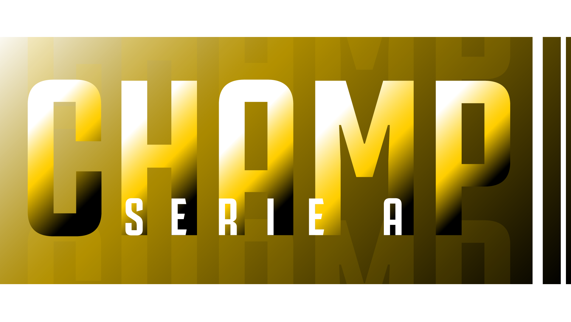
-strong contrast between the background and the text
-showcasing Juventus being the champion of Serie A
First Pass

Fnl Pass

-the team name is lacking readability from a distance
-the purpose a little unclear;
-thin lines of "win" on the background get lost
-all texts can be seen from far away
-serve as the visual displayed when Juventus scores
-unnecessary thin lines are removed
Fnl Pass
First Pass


Mockup on the real stadium screen

Mockup on the real stadium screen

Mockup on the real stadium screen


Final Animation and Quilt Design
A fast, powerful animation style perfectly captures Juventus’ team spirit; driven, energetic, and relentless. Quick movements and bold transitions reflect their on-field intensity and pursuit of victory. This dynamic pacing mirrors the club’s identity: modern, fearless, and always in motion, turning each design frame into a surge of momentum and pride.


bottom of page