top of page

The Neuron
Animated Article
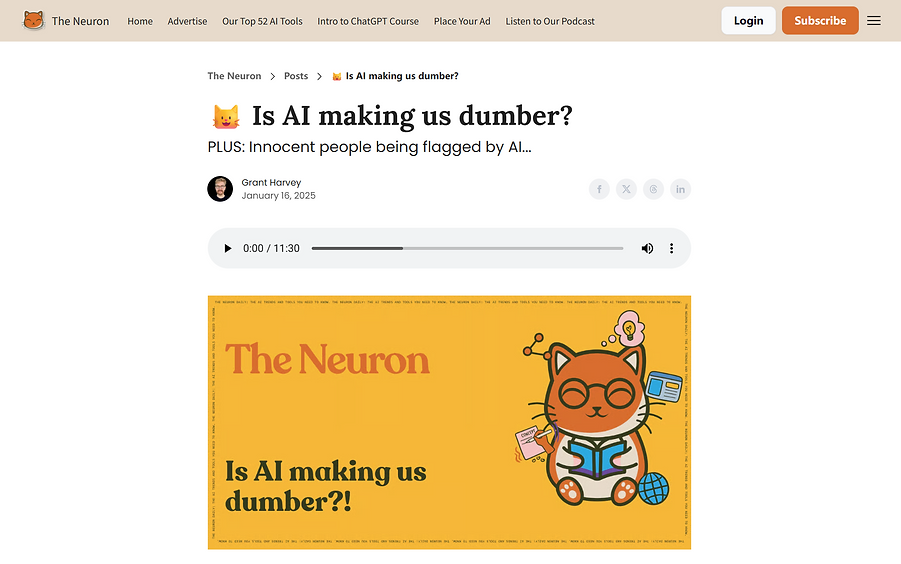
In this project for The Neuron, my goal is to animate their short article “Is AI making us dumber?” so viewers can explore its ideas in a more vivid and relatable way.
Media: Adobe Illustrator, Adobe After Effects

Research
The Neuron is a fast-growing daily AI newsletter that delivers the latest trends, tools, and insights in under 3 minutes. Founded in 2023, it’s now read by over half a million professionals across top tech companies.
Their explainer articles often use an illustrated visual style, so incorporating more graphic-driven design elements would strongly support and enhance their overall branding.


The article argues that while AI can boost learning, it is also making us rely on machines to think for us.
Studies show frequent AI users, especially younger ones, score lower in critical thinking, though education helps counter this. A Nigerian study found teacher-led AI tutoring produced two years’ worth of learning in six weeks, making the learning process much more efficient.
Ultimately, AI’s impact depends on use: guided learning strengthens thinking, while uncritical use weakens it.
Design Approaches Pitch
Design Approach 1
There were 2 design approaches that I pitched to the client.
The first design approach is called "Data Visualized".
This design direction focuses on the scientific aspects of the article, aiming to make the science more engaging by visually translating the data for the audience.
At the end, this was the direction the client picked because it was simple and more sophisticated.

Design Approach 2
The second design approach is called "Based on Primitives".
Every design is built upon basic shapes, and in the same way, AI is built from the most fundamental codes. This concept takes an abstract visual approach while grounding the ideas through visual metaphors and analogies, making the science behind the article easier to grasp and more relatable.
.png)
Challenges
The biggest challenge in this project was figuring out how to turn text into visuals that could be understood without any captions. Pulling out key ideas and translating them into clear, meaningful actions in the animation became a surprisingly fun and rewarding process.
First Pass

Fnl Pass
.png)
-too ambiguous and confusing because all symbol, index, and icons are used
-while focusing too much on "visualizing the data", the composition of this frame is not interesting enough
-texts are used to clarify the different categories, and now the symbols are not at the top of the visual hierarchy
-more depth and much stronger composition
First Pass

Fnl Pass

-according to the article, "younger participants" tends to show higher AI dependance and lower critical thinking, and there isn't enough comparison to indicate "younger"
-with the adult figures as comparison, "younger" is now more obvious
First Pass


-this section explains that the impact of AI depends on how people choose to use it. The best way to illustrate this is to place the two different treatments side by side so their effects on each other are also visible
Fnl Pass

-by placing the two situations on a scale, the audience can now clearly discern their impacts.
The Neuron Interactive Logo
I really like The Neuron’s cat logo, and I think it would be fun to give it more interactive behavior on the website than just wiggling. A cute “meow” animation would fit the logo perfectly, making the brand feel even more appealing and friendly.
Please feel free to try it out here!!

Final Animation (16x9 & 4x5)
16x9
4x5


.png)
.png)


_edited.jpg)
_edited.png)
bottom of page